Anthony Dillon
on 12 April 2021
The web team at Canonical run two-week iterations building and maintaining all of Canonical websites and product web interfaces. Here are some of the highlights of our completed work from this iteration.
This iteration has seen many of the team out of the office as schools are out in the UK. This has not limited the exciting new features and developments from the team.
Meet the team

Hi, I’m Amy. I joined Canonical as Senior UX Designer a week before the pandemic and haven’t been back to the office since. Despite working remotely with the webteam, it still feels like we’re very close and I miss everyone so much.
I started out as a Software Engineer and discovered my passion in HCI and UX with a huge love for dumplings. My main purpose in life is to simplify complicated concepts through interaction design, haptic interfaces, and natural interactions. I’m currently working on MAAS (Metal-as-a-service) which is an awesome provisioning tool for private cloud infrastructure. Some of you might have seen my work on the CLI prototype, workload annotations, event logs handling, LXD projects in MAAS, and many more to come.
I ❤️ cooking because it is very much like product designing – when you learn enough about your audiences’ taste palette, you know how to create a cool dish that they will enjoy. Food, to me, is a form of art that brings you good friends and family. If you really want to make friends, go to someone’s house and eat with him or her, the people who give you their food give you their heart.
Web squad
The Web Squad develops and maintains most of Canonical’s sites like ubuntu.com, canonical.com and more.
Login in the ubuntu.com navigation
Over time ubuntu.com has introduced a number of services which require authentication with our Ubuntu SSO. Each service which requires login handles the login within the page in different ways.
We now have a login option available in the header of the entire site which provides a standardised way of login in and maintaining that state.

Docs linkchecker
The docs team asked if we had a tool for checking links across our websites which could discover broken links in Canonical’s documentation and report these issues to them. We use a tool called linkchecker to crawl our sites and report issues to use in our internal Mattermost channel.
Therefore, we decided to set up the same system to the docs team. We introduced a new set of Github actions to crawl all the sets of docs. And, on a weekly cadence report back any issues to the Docs channel.
This docs we are now scanning regularly are:
- microstack.run/docs
- ubuntu.com/ceph/docs
- ubuntu.com/server/docs
- ubuntu.com/kubernetes/docs
- ubuntu.com/core/docs
- ubuntu.com/openstack/docs
- snapcraft.io/docs
- charmhub.io/docs
- maas.io/docs
- charmed-kubeflow.io/docs
- dqlite.io/docs
- juju.is/docs
- microk8s.io/docs
- multipass.run/docs
- anbox-cloud.io/docs
MAAS
The MAAS squad develops the UI for the MAAS project.
Summing up the self-driven snap upgrade feature
After six design iterations, we’ve come to the final design for the first phase of development. In this work, our goal is to provide upgrade control to MAAS users with snap package format, where all users will be able to select their ideal upgrade time and walk through the upgrading process with error tolerance and security.
In the first phase of our delivery, we want to focus on making sure the data we show are clear and relevant enough to inform our users about the upgrade and the stages that each controller is going through.

There are not a lot of changes via the interactions but a many changes regarding the data. We’ve simplified the data changes into 5 stages from 7+ stages.
Investigate Information Architecture revamp
In the beginning of this cycle, we’ve sent out a cloud-like experience survey to 100 participants to understand our users’ MAAS environment and the scale that we should aim for. The problem with the current information architecture is that it is hard to scale and identify the right flow. So with this work, we hope to identify some overlaps between each feature, simplify them and categorise them properly.

With the information we received from 11 responses in the survey, we are able to gather some lead on which user group we should focus on and how these extreme user groups will provide use cases that will be sufficient for all other use cases in our platform. We’ve also learned about the scale and future scaling potential that can try to target and how these user stories can impact the organisation of Information Architecture. We are still accepting feedback from anyone in the MAAS community who is interested in contributing to MAAS for a better experience. Here is the link to the survey.
Our next step is to do an open card sorting session with the team and map the cluster relationship using K-means clustering method.
Convert the machine details events and logs view to React
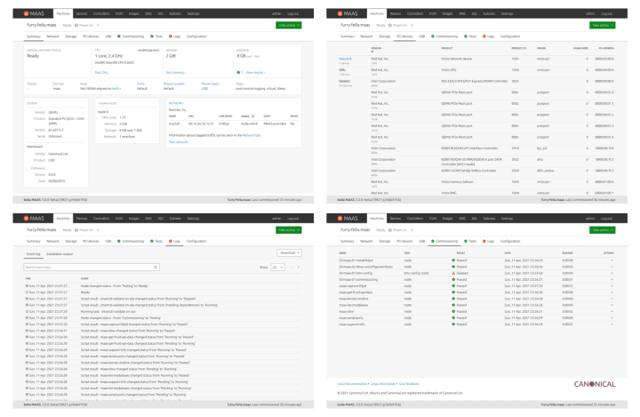
This week we finished migrating the machine details from AngularJS to React. The new machine details has many bug fixes, performance improvements, UX and UI tweaks and a few new features as well.
A lot of work went into this migration so we’re all happy to have this behind us and can’t wait to deliver it to our users in the next release.

Improving LXD VM host support
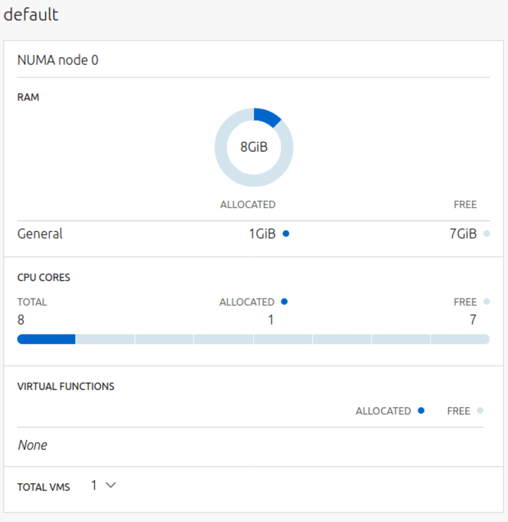
The UI for LXD VM hosts has undergone major changes in order to highlight resources usage across multiple LXD projects. In the “Resources” tab you can now view how much memory/CPU a LXD project is using in context of the entire LXD server’s resources.

The original resources card and NUMA node cards have also been rebuilt with a new underlying data structure (which made the project view possible), and has been made to be more composable should we decide to use these little charts elsewhere.


The last major bit of LXD work is to be able to perform actions on VMs directly from the VM host page instead of having to navigate to the machine list.
JAAS
The JAAS squad develops the JAAS dashboard for the Juju project.
This iteration the team focused mainly on maintenance tasks.
JAAS/Juju feedback survey
Our team has been working hard on providing organised views over models to unit details, and adding actionable features to the dashboard from juju CLI.
We would like to invite all Juju users to participate in this short survey and help us build a better JAAS dashboard user experience.
Please have a look at the survey here:
[JaaS/Juju feedback survey] Bring your experience to our dashboard design!
The purpose of this survey is
- to identify principle/secondary pieces of information in your day-to-day use, so we can provide a clean but essential view on the dashboard;
- to widely gather usage habits around ‘creating offers’, ‘managing relations and CMR’ and ‘running Juju actions’, so we can better position our new features to maximize your ease
The survey would take around 5 minutes.
Thank you!
Vanilla
The Vanilla squad designs and maintains the design system and Vanilla framework library. They ensure a consistent style throughout web assets.
Upstreaming styles from React components
This iteration we focused our efforts on cleaning up our React components library by migrating any custom styling to Vanilla framework itself.
The biggest part of this was upstreaming the styles for the SearchAndFilter component to Vanilla framework.

We also added a footer to the modal dialog component and empty state for the tables that were previously introduced only in the React components.


Tooltip improvements
We took the time this iteration to make a number of improvements to our tooltip pattern, from minor changes like ensuring they appear above all other visible elements on the page, to more significant changes involving the use of JavaScript.
Our current, default tooltip pattern is based purely in HTML and CSS, and works well in many situations, but has a few limitations. First, the actual tooltip needs to be a child of the element the tooltip should appear next to, otherwise we can’t reliably target the tooltip through CSS alone.
We encountered a situation where it was preferable to have the tooltip element exist away from the parent element, so we created a new class – launching with the next Vanilla release – that allows a user to do that with a small amount of JavaScript to listen for certain trigger events.
By introducing JavaScript, we were also able to offer guidance on how and when tooltips should appear. The CSS only version has tooltips appear as soon as the user passes over the element, which may be distracting if the cursor was actually on the way to another point on the page. Because we want tooltips to appear when the page is being navigated by either a mouse or a keyboard, or both, it is also possible to make two tooltips appear at the same time.

Using a JavaScript solution allows us to wait a short time, 200 milliseconds, to ensure the user intends for either the cursor or the current focus of the page to be on the element in question, before showing the tooltip.
We can also then ensure that only one tooltip is ever visible at a time, and make a tooltip disappear when a user has clicked the target element, an event we can be reasonably sure indicates that the user no longer has need of the tooltip and its information.

Logo section
We added a new logo section component that replaces the inline images component. Full blog post to follow.

Snapcraft and Charmhub
The Snapcraft team works closely with the Store team to develop and maintain the Snap Store site and the upcoming Charmhub site.
New look for Snapcraft Forum
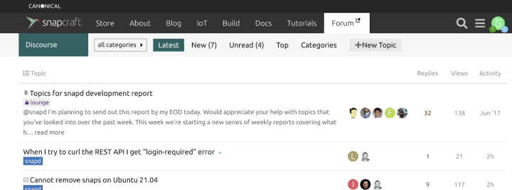
The Snapcraft Forum navigation has been given a fresh look, and is now aligned with the other Canonical forums such as Ubuntu discourse, MAAS discourse and Charmhub discourse.

Team posts:
- Setting up Juju k8s on microk8s
- Add docs to your charm page
- Snapcraft Forum navigation refresh
- [JaaS/Juju feedback survey] Bring your experience to our dashboard design!
We are hiring
- Home based – EMEA
Senior UX Designer ›
Be part of a team working on web applications for enterprise cloud services, IoT and embedded devices, bringing exciting new projects to life and improving existing ones. - Home based – EMEA
Web Developer ›
An exceptional opportunity for a web developer to work within a large team of UX and visual designers and developers building websites and apps.
With ♥ from Canonical web team.


