Anthony Dillon
on 17 March 2021
The web team at Canonical run two-week iterations building and maintaining all of Canonical websites and product web interfaces. Here are some of the highlights of our completed work from this iteration.
Meet the team

My name is Clément, I live in Toulouse, France. I joined Canonical four months ago and I’m working as a frontend developer in the web team.
Due to the pandemic, I haven’t had a chance to meet my lovely colleagues in person yet but I can’t wait to jump on a plane/train to London as soon as it is safe to do so.
At the time of writing, I’m working on the Ubuntu Advantage shop adding support for monthly subscriptions among other things.
Things I like include cooking, corny jokes, writing CSS, gaming (video and tabletop), cheesy pop music, and cross-stitching.
Web squad
The Web Squad develops and maintains most of Canonical’s sites like ubuntu.com, canonical.com and more.
Updates to the new Ubuntu Advantage shop
Much of our focus for the team this iteration was on finishing off and applying some polish to the new Ubuntu Advantage shop. The subscription management view has been tightened up to accommodate the user guidance and management options of subscriptions.
Second level navigation in the Chinese website
We have added second level navigation to the Chinese site to accommodate the Core page. You can see this https://cn.ubuntu.com/internet-of-things
New hackfest page for OSM
With every release, the OSM community organizes the OSM Hackfest. We created a page for this.
Brand
The Brand team develop our design strategy and create the look and feel for the company across many touch-points, from web, documents, exhibitions, logos and video.
OSM documentation diagrams
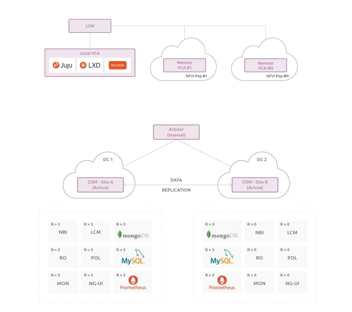
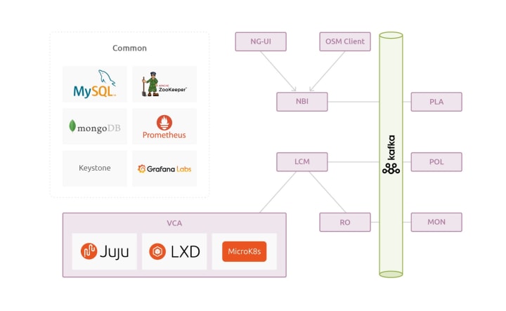
With the creation of the first deployment documents for Charmed OSM, we designed a few diagrams to be used in the documentation to illustrate Charmed OSM more clearly.
OpenStack diagram
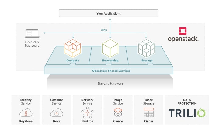
Redrawn diagram showing how your applications can integrate with OpenStack.
OpenStack private cloud illustrations
Illustrations for an upcoming new page for OpenStack private cloud, including an interactive slider to demonstrate the cost-effective nature of private cloud with large volume VM usage.


ESM for ROS illustration
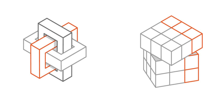
We were tasked with creating an illustration to go into the ESM for ROS webpage that showed the addition of Extended Security Maintenance for robots running on ROS & Ubuntu. We did a number of variations that bring a little personality to the page.

Brand Hierarchy: Canonical & Ubuntu
We carried on our work to create greater brand alignment by bringing Canonical and Ubuntu closer together and see how this manifests into our current visual language and the various media outputs. We also took some time to look at modernising the Circle of Friends which we can hopefully start to implement in the near future.
MAAS
The MAAS squad develops the UI for the MAAS project.
React migration
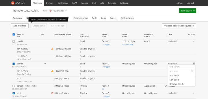
The work to migrate the machine details to React continues. The latest to be migrated is the network tab. Along the way, we’re fixing bugs and making small UX improvements
The updated network tab now has hints when actions are disabled so that the user knows what steps are needed to be taken to complete a task.
LXD KVM updates
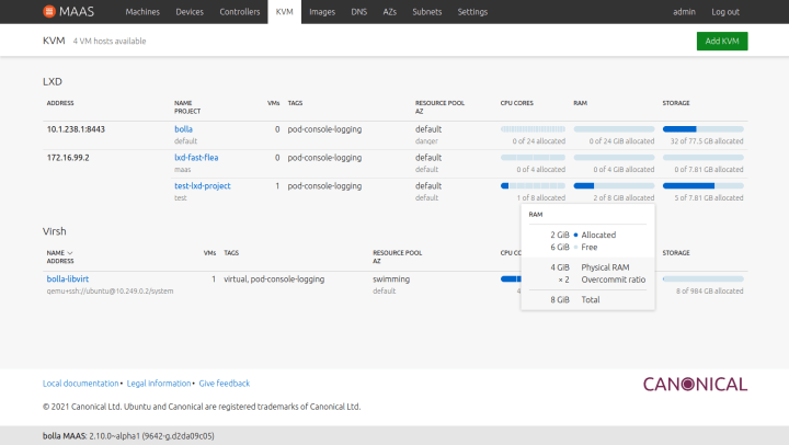
MAAS is in the process of increasing support for LXD projects, which are a way to split up LXD servers. These changes require a big shift in how the KVM pages function, since now LXD KVMs need to be aware of other projects within the server.
The first change is in the KVM list itself, where they are now split into two separate tables for LXD and virsh KVMs. The LXD section is also now grouped by server address.
JAAS
The JAAS squad develops the JAAS dashboard for the Juju project.
New layout implementation
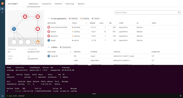
In preparation for a suite of new features in the Juju/JAAS dashboard, we’ve been implementing an updated layout that moves actionable content into sliding panels while informational content is presented in the core of the page. To this end in an upcoming release, you’ll see a new UI that looks a lot like the following.


New navigation implementation
There has been some back and forth on various different methods of navigating up and down the data set that is presented by a model. The design and UX team did an awesome job in the last iteration devising user tests and conducting them across the team and the wider company
In this iteration, we implemented the breadcrumb style navigation. You can now drill down into an application and further into a unit with a persistent breadcrumb to jump back to any level
Model view:

Application view:

Unit view:

Dashboard mobile designs
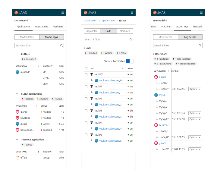
We’ve been busy designing our mobile layouts for the JAAS dashboard to try and provide a better mobile experience for our users. Below are some screenshots of some of the pages. These will be coming as part of the new layout work mentioned above.
Managing relations and cross model relations exploration
We designed the experience of managing relations and cross model relations on the dashboard, following the common usage flows, assuring the triggers are discoverable and content is sensible
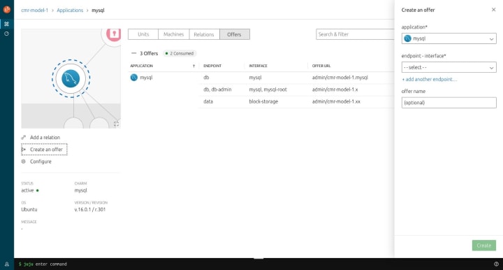
Creating an offer
This feature will open an action panel, for users to choose the application and its endpoints to share with external models.
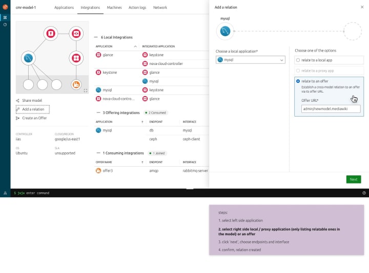
Adding a relation
By selecting a local application, users have the ability to relate to a local application / a proxy application (consumed offer but not yet related) / an offer URL.
Desktop
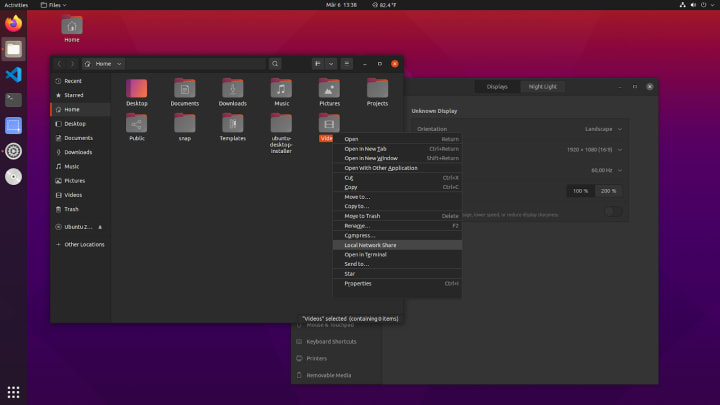
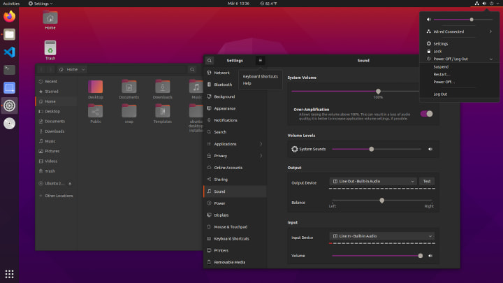
Ubuntu Desktop 21.04 will contain various improvements, including a redesigned dark theme, and an improved light theme, both incorporating changes in gnome-shell and gtk (fully light gtk, mixed light gtk, fully dark gtk with permanent dark shell). There have also been small accessibility improvements in the navigation and new MIME type icons as part of the Yaru theme.
Switches and toggles have been redesigned with more of a Ubuntu feel to them. Desktop users will be able to switch between a light mixed theme and a complete dark theme starting in 21.04. The Yaru theme is completely maintained by a volunteer community with some support from the Canonical design team. We want to thank all contributors who were involved.
Vanilla
The Vanilla squad designs and maintains the design system and Vanilla framework library. They ensure a consistent style throughout web assets.
Search and filter
The search and filter component was previously implemented in our React library and we just upstreamed any necessary styling to Vanilla CSS.

Panel animations in application layout
Enhancements to the application layout have been applied with some panel animations.
Indeterminate checkbox
Brand new styles for an indeterminate state of checkbox input have landed and will be released in the next release of Vanilla framework. There are useful when there is a need for a middle ground state.
Sticky footer
Often we need to footer to stick to the bottom of the page. Therefore we introduced the site layout with a sticky footer option.
Stores
The Snapcraft team works closely with the Store team to develop and maintain the Snap Store site and the upcoming Charmhub site.
Investigate pagination for the homepage of charmhub.io
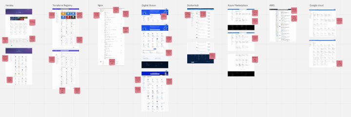
We worked on an exploration of how to scale up the homepage of Charmhub when we have a larger amount of charms. At the moment the homepage loads all the public charms, of which there are about 400. In order to improve this experience, we explored how other stores implement pagination and worked on our own proposal.
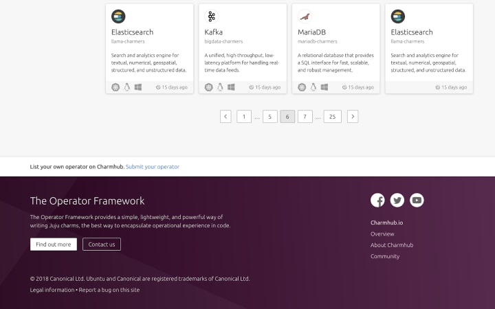
As a starting point we decided on having 25 charms per page, and to display actions to navigate to the previous and next page, as well as first and last.
Team posts:
With ♥ from Canonical web team.


